Pound Town is a strong, crisp drink made for trail days, long rides and the moments after. They needed a brand and can design with real attitude, one that looks as good in a backpack as it does on the shelf.
Pound Town
A bold drink for people who earn their summit.
About the client
Pound Town is built for the outdoors crowd, mountain bikers, hikers and adventurers who like their drinks as bold as their weekends. The brand lives where the trail ends and the stories begin.
What we did
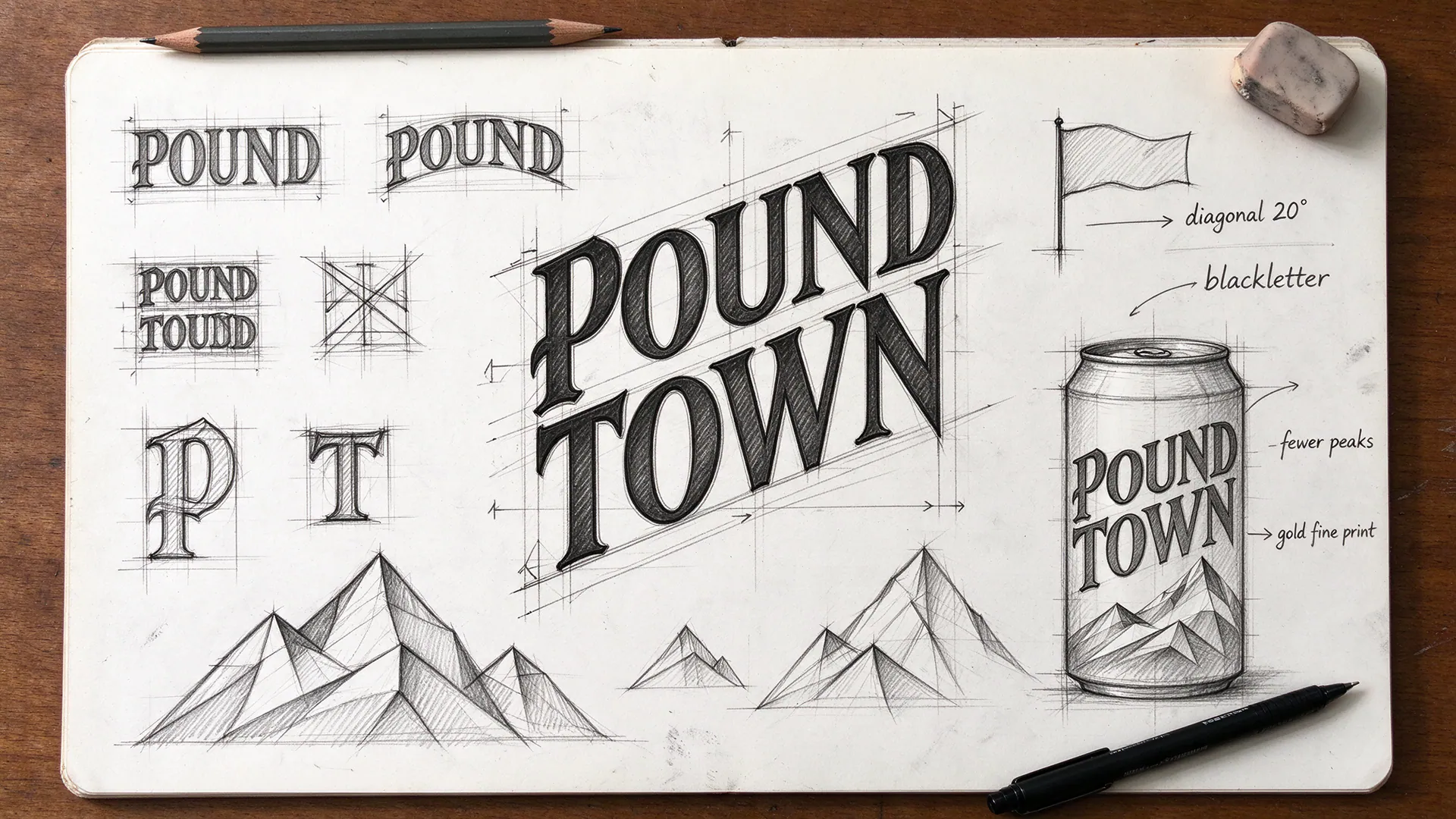
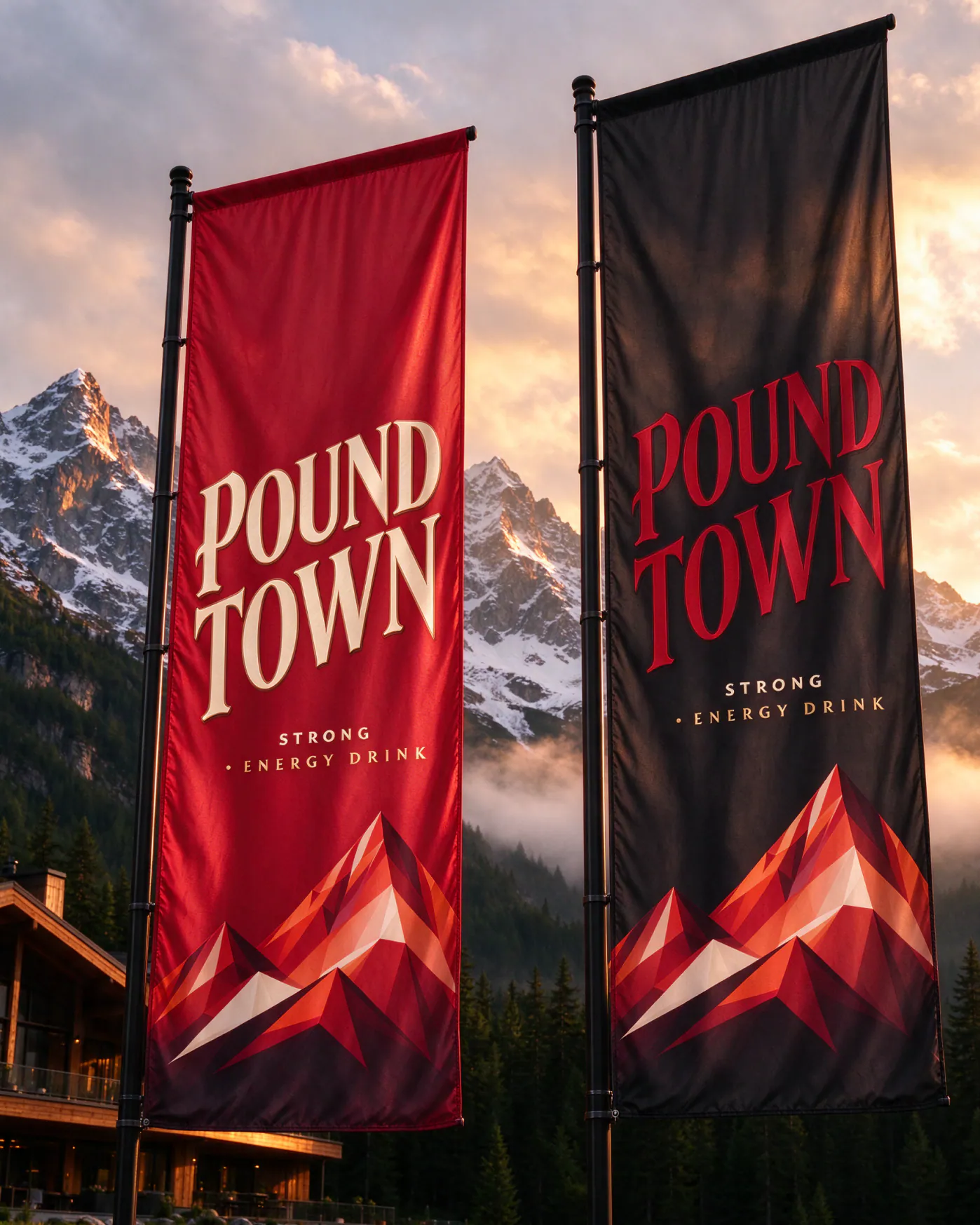
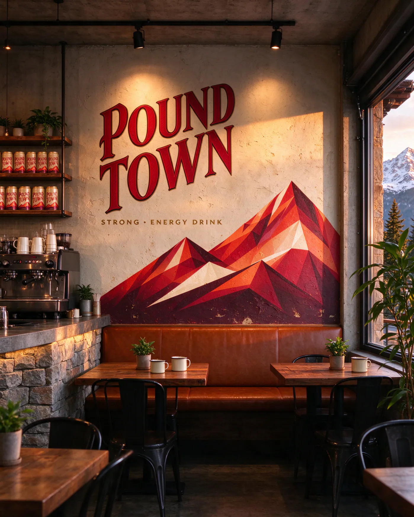
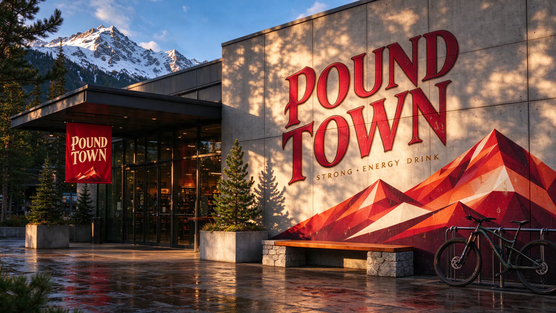
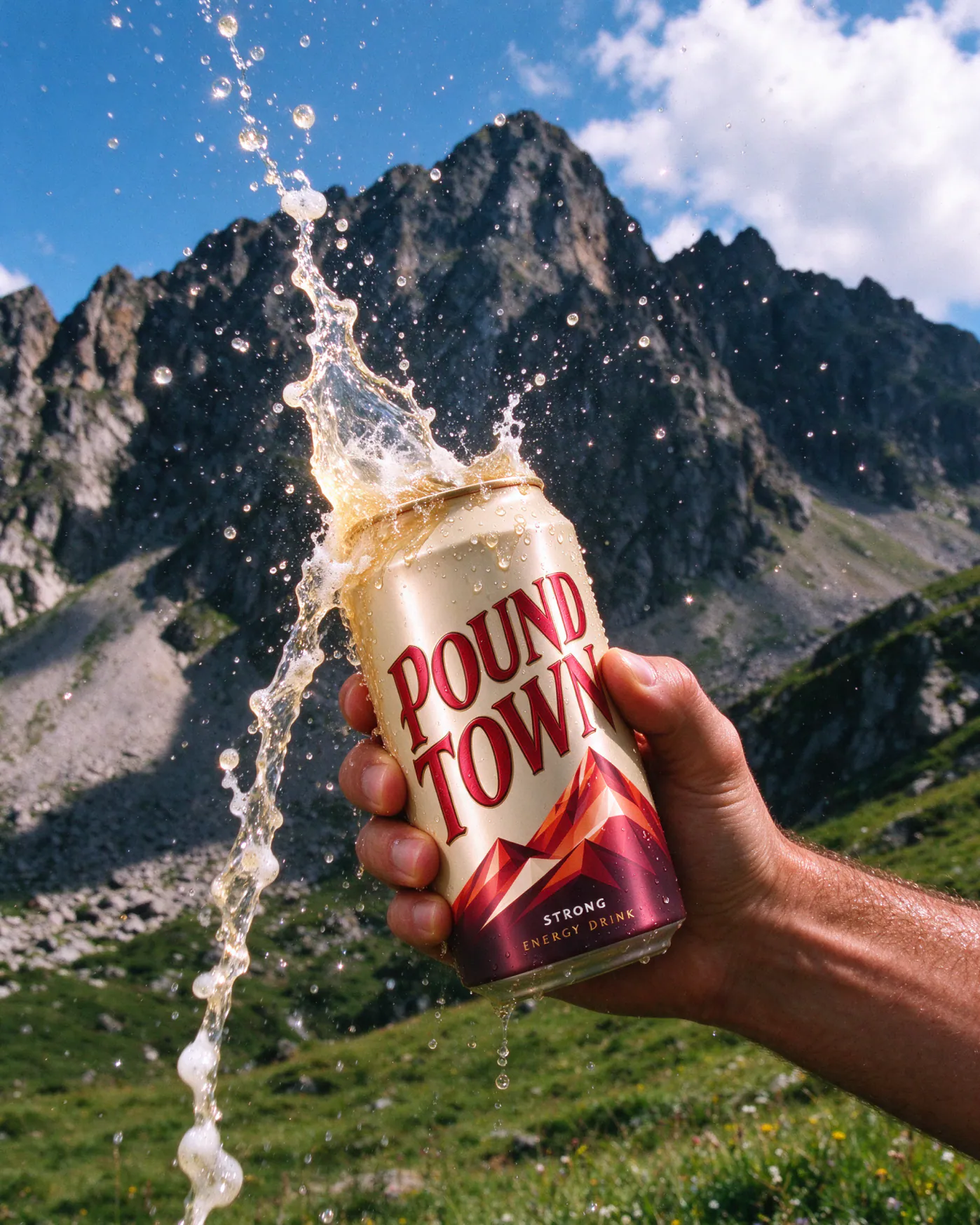
We began with pencil: sketching dozens of lettering options before landing on a confident, blackletter-inspired wordmark set on a diagonal. A four-peak mountain illustration sits below it, representing the climb.
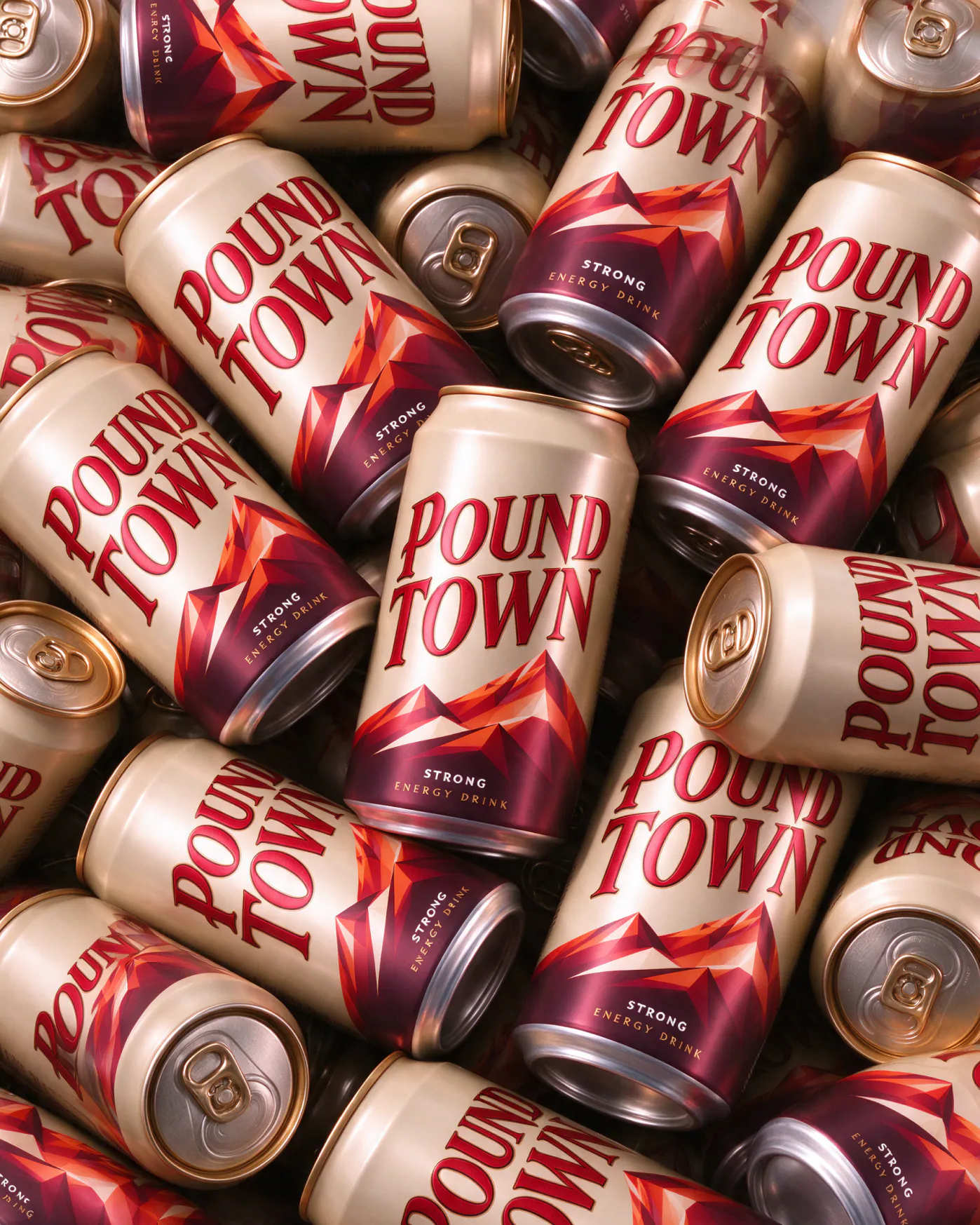
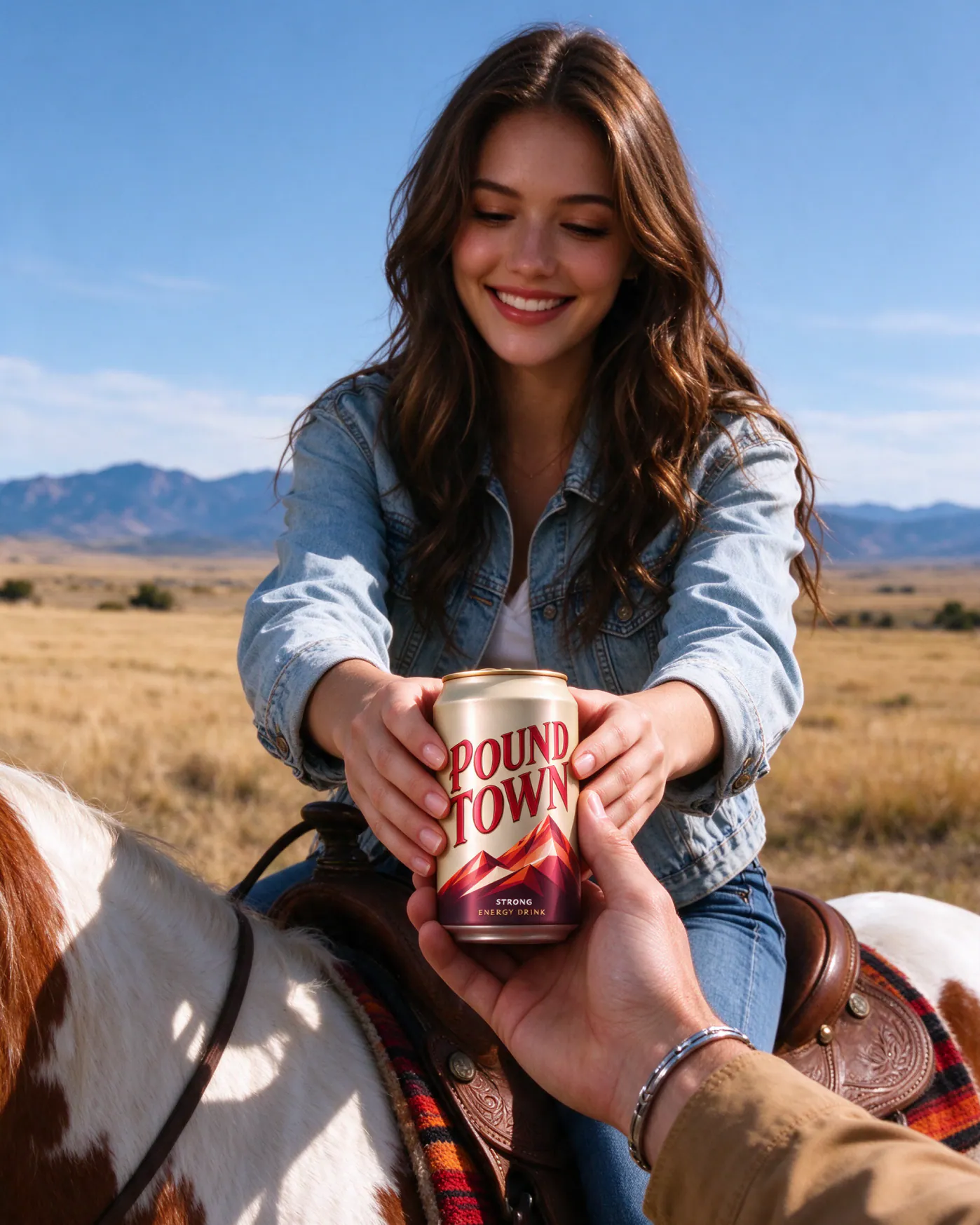
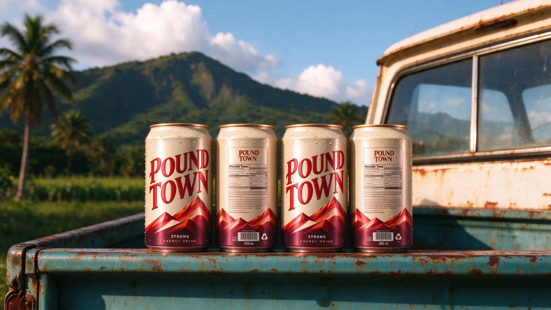
The final can pairs deep red lettering with a gradient mountain scene and gold fine-print details, and the identity is ready to scale to multipacks, merch and event graphics.
Challenges
The name is loud and memorable, so the design had to match its energy without feeling cheap. Heritage-style lettering and careful illustration gave the brand a premium, crafted feel.
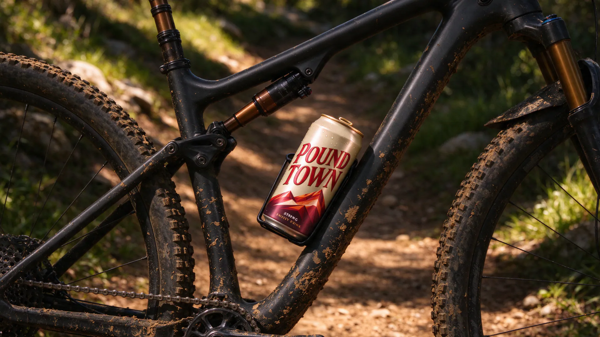
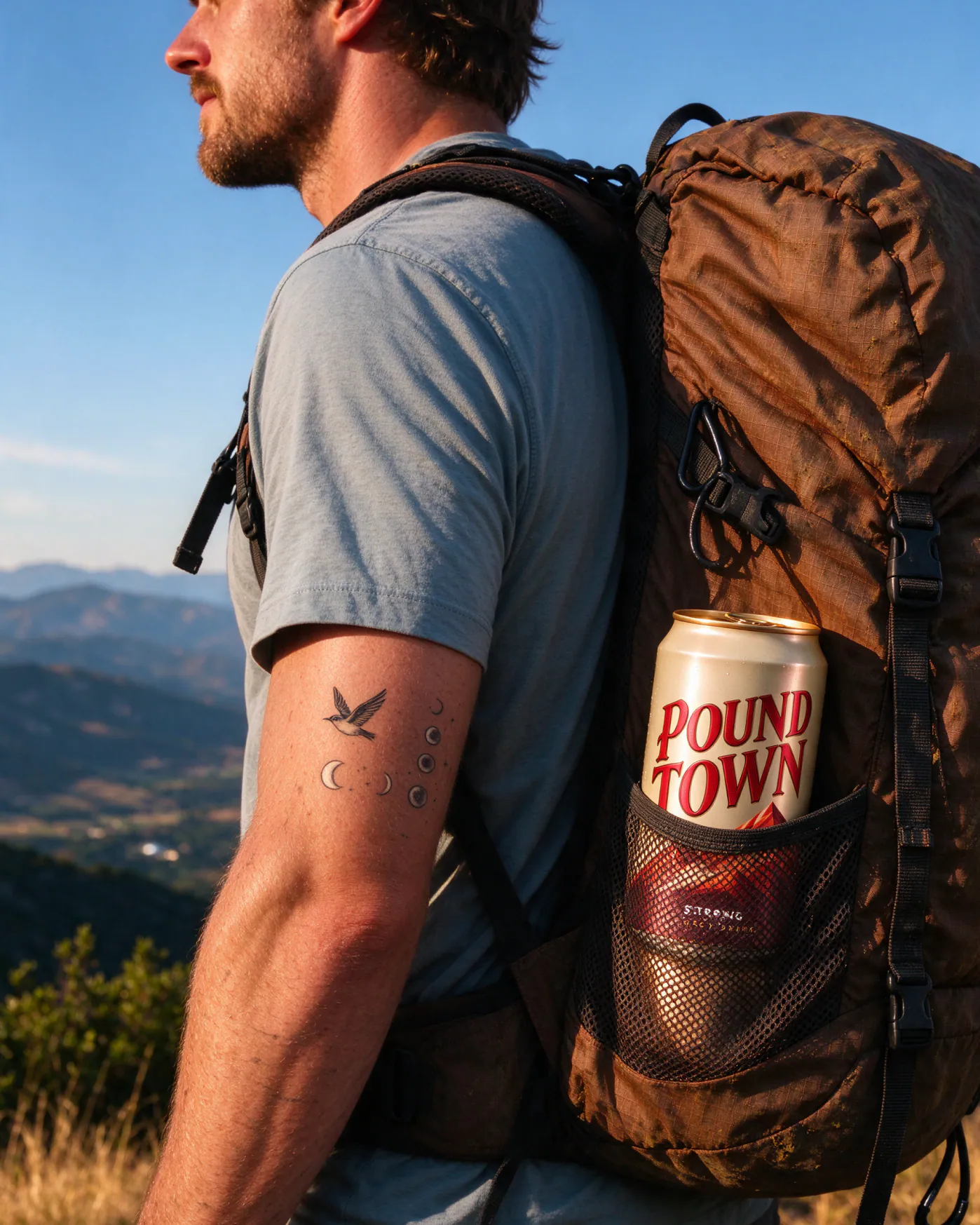
The can also had to read instantly from a distance, on a bike cage or in a backpack pocket, so we kept the layout bold and simple.
More projects (2)
View all